Wednesday, July 27, 2011

Days of the Week

Link

The origins of the names of the days of the week:

Saturday

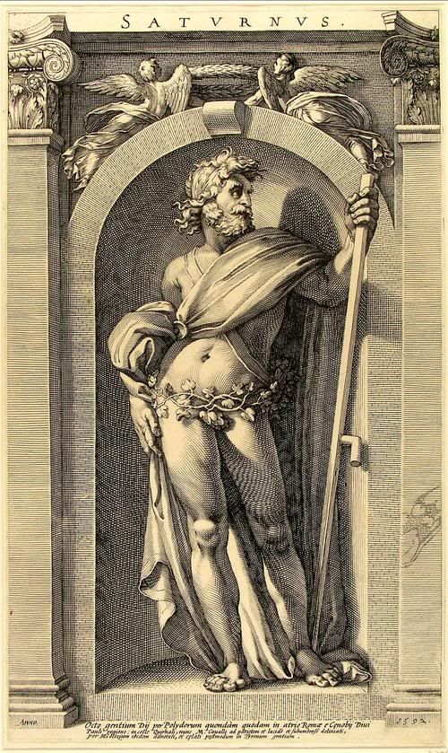
The word "Saturday" originates from the latin word "dies saturni"/"day of Saturn"

It was named after the planet within the 2nd century by the Romans. The planet was named for the Roman god of agriculture. It has been called dies Saturni ("Saturn's Day"), through which has evolved into Old English as Saterdaeg and gradually evolved into the word "Saturday".
Image

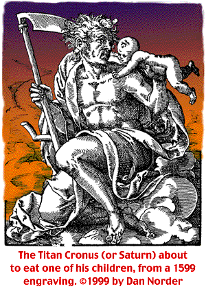
In Greek Mythology "Cronus" was worshiped as a harvest deity, overseeing crops such as grains, nature and agriculture. He was usually depicted with a sickle, which he used to harvest crops and which was also the weapon he used to castrate and depose Uranus. Cronus is associated with the Roman god Saturn.
Image

http://s2.webstarts.com/lunarsabbath/origin_of_saturday.html

Sunday

Sun worship infects ancient Israel: In the ancient world, 'sun worship' was one of the most common forms of pagan idolatry. Immediately after Israel left Egypt, God warned His people against being "driven to worship the sun." Deuteronomy 4:19…..' And lest thou lift up thine eyes unto heaven, and when thou seest the sun, and the moon, and the stars, even all the host of heaven, shouldest be driven to worship them, and serve them, which the LORD thy God hath divided unto all nations under the whole heaven.' ….. Yet Israel later yielded to temptation, compromised with the nations around them, and dedicated their "horses ... to the sun." 2 Kings 23:11. During a time of revival, King Josiah purged much of Israel and "burned the chariots of the sun with fire." 2 Kings 23:11. Before the Babylonian captivity, many Israelite leaders rejected their Creator, yielded again to idolatry, and "worshipped the sun toward the east." Ezekiel 8:16……' And he brought me into the inner court of the LORD's house, and, behold, at the door of the temple of the LORD, between the porch and the altar, were about five and twenty men, with their backs toward the temple of the LORD, and their faces toward the east; and they worshipped the sun toward the east.' …… Sounds a lot like the 'sunrise service' many churches have at easter.


Chemtrails and other garbage

50 Years of Packages That Fool Stupid People

LINK

50 Years of Packages That Fool Stupid People

Quick
1960s - EASY
Popular easy foods: Nestle's Quik, Shake 'n Bake, Cool Whip, Tang, SpaghettiOs

Sunday, July 10, 2011

21 Logo Evolutions of the World’s Well Known Logo Designs

Source

The evolution of logo designing could be traced back to the Ancient Greece, when the rulers and their dynasties used to use cipher as a monogram in their coins.  However, the modern logo designing dates back to the early days of the Renaissance, around the 13th Century. Goldsmiths, masons, paper makers, and potters, were among the first trades people to use marks-pressings into gold, chiseled symbols, watermarks on paper, and simple thumb-prints on pottery.
Today there are many corporations, products, brands, services, agencies and other entities using an ideogram (sign, icon) or an emblem (symbol) or a combination of sign and emblem as a logo. However, only a few of the thousands of ideograms people see are recognized without a name.
Let’s look at the history and evolution of the well known logo designs. If you are a logo designer, I bet you will learn a lot from their mistakes, and a long path of improvements until they’ve reached the final design. If you are just an ordinary mortal – don’t worry, this will be at least very entertaining for you.
P.S.: I’ll try to keep this logo evolution post up-to-date as much as possible. So, if you see anything missing here on Bored Panda’s logo evolutions list, please let me know!

Pepsi Logo Evolution

(via boredpanda)
Manufactured and marketed by PepsiCo, it was first developed and produced in the early 1890’s by Caleb Bradham, a pharmacist in New Bern, North Carolina labeled as “Brad’s drink”. In 1898, Bradham renamed his drink into “Pepsi-Cola”.

Thursday, July 7, 2011

Top 15 Worst Logo FAILS Ever


Source

Marketers say that one of the most important marketing tools is a good logodesign. It not only provides an easy to recognize identity for your business but also communicates who you are. That’s why every company considering creating or buying a logo design should know the criteria that make for an effective logo.

The first feature of a good and effectivelogo is that it can immediately “grab” viewer’s attention. Your logo should have an immediate impact and hold the viewer’s attention.

However, if you did manage to catch the viewer’s eye – that doesn’t necessary mean you are doing good. There might always be a hidden penis you cannot see at first sight.

Here’s a list of Top 15 Worst Logo Fails of all time which probably didn’t look so bad at first glance.

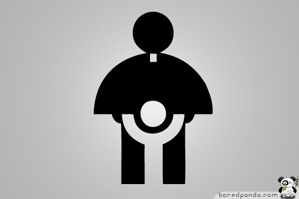
Logo of Catholic Church’s Archdiocesan Youth Commission

This is an actual logo designed in 1973 for the Catholic Church’s Archdiocesan Youth Commission. It even won an award from the Art Directors Club of Los Angeles.

Honest Logos By Viktor Hertz (Part II)

Source

For those who haven’t seen the Part I of Honest logos by Viktor Hertz, first take a look: here. Now that you’ve done that, we’d like to show you some more new logos from Viktor’s ongoing series titled “Honest logos”.

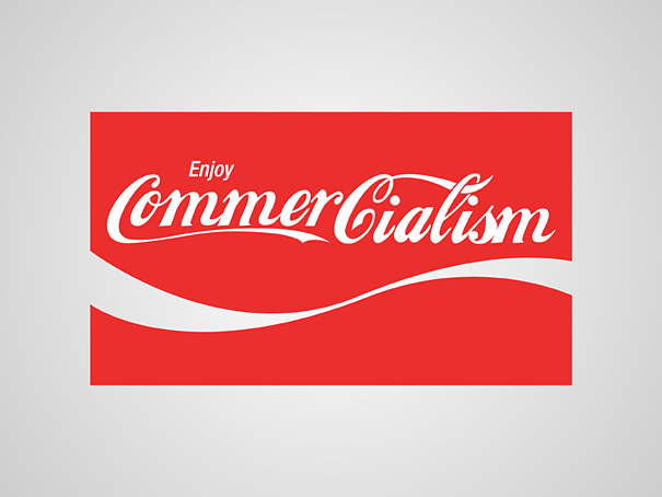
As we’ve talked before, Viktor Hertz is a freelance Graphic Designer from Sweden who turns well known logos into “Honest Logos”. He does that by cleverly changing the name of the company while still preserving the original style of the logo.

“An idea for a series with honest logos, revealing the actual content of the company, what they really should be called. Some are cheap, some might be a bit funny, some will maybe be brilliant. I don’t know.” says the artist.

Websites: flickr | twitter

Honest Logos By Viktor Hertz (Part I)

Source

We’ve already laughed at the Top 15 Worst Logo FAILS Ever, tried to find hidden objects in 30 Clever Logos With Hidden Symbolism and even learned some history from 21 Logo Evolutions of the World’s Well Known Logo Designs, but we’ve never looked at what would happen if companies created honest logos.

Viktor Hertz, a freelance Graphic Designer from Sweden, finally did it – he turned well known logos into “Honest Logos”.

“An idea for a series with honest logos, revealing the actual content of the company, what they really should be called. Some are cheap, some might be a bit funny, some will maybe be brilliant. I don’t know.” says the artist.

Websites: flickr | twitter

36 More Clever Logos With Hidden Symbolism, Part 4

Source

If you are a graphic designer looking for some logo ideas and inspiration, then it’s your lucky day because we handpicked another list of Clever Logos With Hidden Symbolism. And if this is not enough, there’s 100+ more creative logos in our previous posts: see part I, part II andpart III.

However, if you are a mere mortal and not a designer, you can still view these cool logos and try to find the hidden symbols. Oh, and if you wanna have a good laugh, don’t forget to check out the Top 15 Worst Logo FAILS Ever and Honest Logos by Viktor Hertz. If you are more into history, then you might wanna take a look at 21 Logo Evolutions of the World’s Well Known Logo Designs.

Now, enough will all the old post promotion stuff, let’s jump to the pictures! However, note that part of the logos are still only proposals waiting to be acquired by some lucky company.

1. Diamond Bookstore

Designed by JoannaMalik

33 More Creative Logos With Hidden Symbolism, Part 3

Source

If you are a logo designer looking for some typography and logo inspiration, then it’s your lucky day because we’ve made another list of Creative Logos With Hidden Symbolism. And if this is not enough, there’s 70 more incredibly clever logos in our previous logo collections: see part I and part II.

However, if you are a mere mortal and not a designer, you can still view these cool logos and try to find the hidden symbols. Oh, and if you wanna have a good laugh, don’t forget to check out the Top 15 Worst Logo FAILS Ever and Honest Logos by Viktor Hertz. If you are more into history, then you might wanna take a look at 21 Logo Evolutions of the World’s Well Known Logo Designs.

Now, enough will all the old post promotion stuff, let’s jump to the pictures! However, note that part of the featured logos are still only proposals waiting to be acquired by some lucky company.

1. VinoPiano

Vine glasses also look like piano keys. (Designed by Mootto Studio)

40 More Clever Logos With Hidden Symbolism, Part 2

Source

You probably already think that we are obsessed with logo design (and you’re probably right), but our numbers show that most of you guys enjoy logos as much as we do.
That’s why we proudly present 40 more clever logos with hidden symbolism. If you missed part I, you can find it here.
But before you start scrolling down the list, let me quickly run trough the list of logotype posts we had earlier: Top 15 Worst Logo FAILS Ever21 Logo Evolutions of the World’s Well Known Logo Designs, and Honest Logos by Viktor Hertz. You may open them somewhere in a new browser tab and continue from here.
Oh, and don’t forget to tell us which logo design you liked or hated most! We are really interested to hear what you think.

1. Black Cat


Letters “c” are also cat’s eyes. (Designer: vasvari)

Funny Farms: 12 Cool Agricultural Architecture Conversions


by Steph
Silvery barn wood, exposed timbers, the sense of history and pastoral contentment – rural ruins have a lot to offer, whether they’re simply converted for new uses or creatively incorporated into novel structures. From great big barns to piles of century-old rubble, agricultural buildings have been adapted and recycled into stunning modern homes that are surprisingly bright, airy and up-to-date.

11 Mythical Places You Want To Live In

September 15, 2008 by uphaa


Are you tired of the boring day to day aspects of life? Do you want something new and exciting? Then these are the 11 places you want to live. They are all places that have come from fiction and each one has a special something to make life interesting and enjoyable. This list is in no particular order.

Camelot

Reason for living here: King Arthur lives here and you can joust all day long!
Camelot comes from legendary British tales of King Arthur – who may, or may not, have been real. In Camelot we find Arthur’s famous round table where his knights get to sit around like equals and have a few beers while they discuss their latest knightly conquests. Camelot is surrounded by forests and rivers, so you can get in a spot of fishing and hunting if it floats your boat. Justice and peace reign in Camelot. Oh – and the ultra-hot (in a medieval way) Guinevere lives there too!

Epic fails. The best of the best. Part 3 (77 pics)

Posted by Izismile Staff in Picdumps   6 Oct 2009 
Today, we present the third and final part of various failures. 
Only the most fresh and recent pictures got in this collection. Enjoy!


1Epic fails. The best of the best. Part 3 (77 pics)

Epic fails. The best of the best. Part 1 (79 pics)

Posted by Izismile Staff in Picdumps   2 Oct 2009
As they say, no one is immune from failure. 
Very funny compilation and in any case not the last. Very soon will post another one. 
And meanwhile, let’s look at the first part. 


1Epic fails. The best of the best. Part 1 (79 pics)

Wednesday, July 6, 2011

30 Clever Logos With Hidden Symbolism, Part 1

Source

I am sure every panda enjoyed laughing at Top 15 Worst Logo FAILS ever but let’s be fair here, and look at some of the best logo design examples. To be more specific, let’s have a look at creative Logos With Hidden Messages.
As we wrote earlier, the first feature of a good and effective logo is that it can immediately “grab” viewer’s attention. A good way to do so is by giving viewers a little puzzle to solve. Everyone likes puzzles, right? When viewers get the hidden message behind the logo, there’s this instant little satisfaction feeling, and something fun likes this gets people talking and sharing.
Even if the viewer cannot see anything hidden at first sight, the second somebody explains it to him will make the logo stick into his head for a long time.
Now let’s jump to the list of the most creative and clever Logos With Hidden Symbolism, and learn from the best!

1. Circus of Magazines

Circus tent looks like a magazine (more like a book to me, but still very clever). (Designer: logotomy)
 
Related Posts Plugin for WordPress, Blogger...