I am sure every panda enjoyed laughing at Top 15 Worst Logo FAILS ever but let’s be fair here, and look at some of the best logo design examples. To be more specific, let’s have a look at creative Logos With Hidden Messages.
As we wrote earlier, the first feature of a good and effective logo is that it can immediately “grab” viewer’s attention. A good way to do so is by giving viewers a little puzzle to solve. Everyone likes puzzles, right? When viewers get the hidden message behind the logo, there’s this instant little satisfaction feeling, and something fun likes this gets people talking and sharing.
Even if the viewer cannot see anything hidden at first sight, the second somebody explains it to him will make the logo stick into his head for a long time.
Now let’s jump to the list of the most creative and clever Logos With Hidden Symbolism, and learn from the best!
1. Circus of Magazines
Circus tent looks like a magazine (more like a book to me, but still very clever). (Designer: logotomy)
2. Backspace
Just looking at the logo makes you want to press “backspace” and correct the typo. (Designer: JoePrince)
3. Barcode
Notice that the word “bar” is darker. (Designer: Sean Heisler)
4. To beat or not to beat?
The question mark is made of a belt.
5. Bipolar
The Logo depicts ambiguous emotions. (Designer: Siah Design)
6. Bird
Letter “B” is also a bird.
7. Cafe Click
Coffee steam is made of mouse pointers (Designer: Leo)
8. Amazon
The arrow from A to Z, symbolizes what Amazon is known for selling everything from “a to z” . It also serves as a smile, making the company feel friendly and approachable.
9. City Direct
“Notice how the space around the plane forms the letters C and D.” (Tobias) (Designer: Logomotive)
10. Elefont
There’s an elephant trunk inside the letter “e”. (Designer: m1sternoname)
11. Formula 1
Empty space in the middle creates a number “1″ for “Formula 1″
12. Families
Those 3 letters in the middle ‘i’, ‘l’, and second ‘i’ represent a family (father, mother and a child, or 2 fathers and a child in some countries).
13. F*ck!
A bit provocative logo against nazism and racism. (Designer: Karl Design)
14. FedEx
If you look closer you’ll notice the right-pointing arrow in between the ‘E’ and the ‘x’, representing precision and speed at which FedEx works.
Update: Anyone else see the spoon in “Fed” of Fedex? (@lissnup)
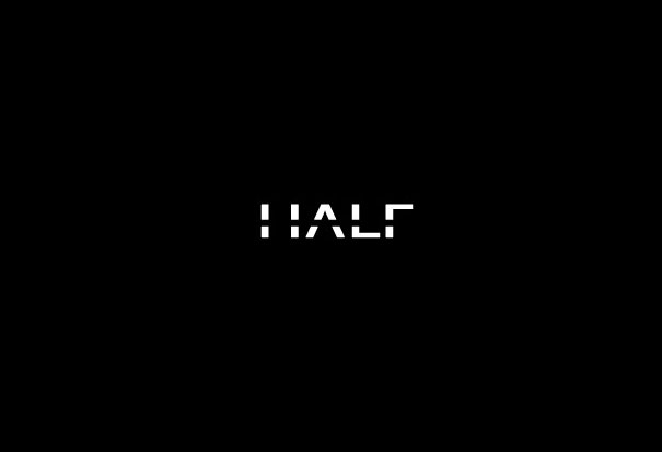
15. Half
16. Iron Duck
A hanger looks like a duck. (Designer: Siah Design)
17. Yoga Australia
Woman is making a pose that forms the Australian continent between her leg and her arm.
18. Killed Productions
Letter “i” is lying as if it was killed. (Designer: Ethereal)
19. Mosleep
Mosleep is an organization of doctors that deals with people having sleeping disorders. The logo is their intial ‘M’ that was designed to also look like a bed. (Designer: Muamer)
20. Mr.Cutts
The scissors are transformed to look like a face with glasses and mustache. (Designer: Tabitha Kristen)
21. NBC
There’s a hidden peacock looking to the right representing the company’s motto to look forward, and not back.
22. Pencil
Letters “i” and “l” form a pencil. (Designer: reghardt)
23. Push The Bottle
You can see a hand pushing a button inside the bottle. (Designer: Hemisferiod)
24. Shocked
The socket’s expression says it all. (Designer: Fogra)
25. Sushi
Letter “H” looks like chopsticks picking a sushi. (Designer: Type08)
26. Threesome
27. Twins
Letter “N” looks like number 2, symbolizing twins. (Designer: Actiondesigner)
28. Up
An arrow showing up forms a letter “u” and also has a hidden “p” inside. (Designer: m1sternoname)
29. Wine Searcher
It looks like eyeglasses binoculars and bottles of wine at the same time. (Designer: Itsgareth)
30. Zip
(Designer: logomotive)
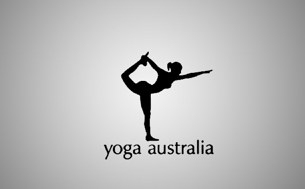
Extra: Yoga...
Woman is making a pose that forms the Australian continent between her leg and her arm.


No comments:
Post a Comment