Showing posts with label logo. Show all posts

Wednesday, January 18, 2012

Spell It Out: 16 Abbreviated Company Names Explained

Spell It Out: 16 Abbreviated Company Names Explained 

by Ethan Trex - May 6, 2010 - 11:36 AM  {VIA - mental_floss}
Dozens of companies use acronyms or initials in their names, but how well do you know what the abbreviated letters 
mean? Let’s take a look at the etymologies behind a few abbreviated company names.

1. CVS

Sorry, drugstore fans, there aren’t three fatcat pharmacists with these initials running around out there. When the pharmacy chain was founded in Lowell, MA in 1963, it was known as “Consumer Value Stores.” Over time the name became abbreviated to simply CVS.

2. K-Mart

Longtime five-and-dime mogul Sebastian S. Kresge opened his first larger store in Garden City, Michigan, in 1962. The store was named K-Mart after him. (Kresge had earned the right to have a store named for him; he opened up his new venture at the tender age of 94.)
Sunday, July 10, 2011

21 Logo Evolutions of the World’s Well Known Logo Designs

Source

The evolution of logo designing could be traced back to the Ancient Greece, when the rulers and their dynasties used to use cipher as a monogram in their coins.  However, the modern logo designing dates back to the early days of the Renaissance, around the 13th Century. Goldsmiths, masons, paper makers, and potters, were among the first trades people to use marks-pressings into gold, chiseled symbols, watermarks on paper, and simple thumb-prints on pottery.
Today there are many corporations, products, brands, services, agencies and other entities using an ideogram (sign, icon) or an emblem (symbol) or a combination of sign and emblem as a logo. However, only a few of the thousands of ideograms people see are recognized without a name.
Let’s look at the history and evolution of the well known logo designs. If you are a logo designer, I bet you will learn a lot from their mistakes, and a long path of improvements until they’ve reached the final design. If you are just an ordinary mortal – don’t worry, this will be at least very entertaining for you.
P.S.: I’ll try to keep this logo evolution post up-to-date as much as possible. So, if you see anything missing here on Bored Panda’s logo evolutions list, please let me know!

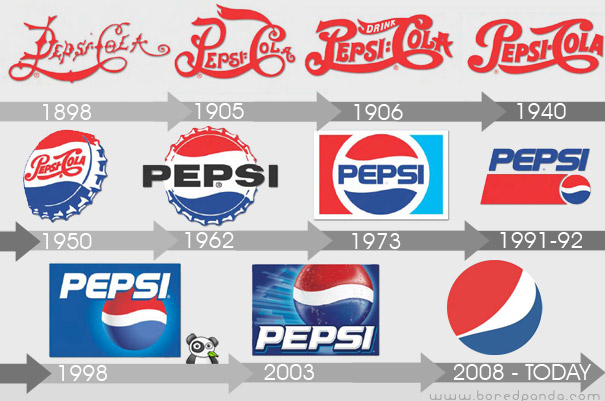
Pepsi Logo Evolution

(via boredpanda)
Manufactured and marketed by PepsiCo, it was first developed and produced in the early 1890’s by Caleb Bradham, a pharmacist in New Bern, North Carolina labeled as “Brad’s drink”. In 1898, Bradham renamed his drink into “Pepsi-Cola”.

Thursday, July 7, 2011

40 More Clever Logos With Hidden Symbolism, Part 2

Source

You probably already think that we are obsessed with logo design (and you’re probably right), but our numbers show that most of you guys enjoy logos as much as we do.
That’s why we proudly present 40 more clever logos with hidden symbolism. If you missed part I, you can find it here.
But before you start scrolling down the list, let me quickly run trough the list of logotype posts we had earlier: Top 15 Worst Logo FAILS Ever21 Logo Evolutions of the World’s Well Known Logo Designs, and Honest Logos by Viktor Hertz. You may open them somewhere in a new browser tab and continue from here.
Oh, and don’t forget to tell us which logo design you liked or hated most! We are really interested to hear what you think.

1. Black Cat


Letters “c” are also cat’s eyes. (Designer: vasvari)

Wednesday, July 6, 2011

30 Clever Logos With Hidden Symbolism, Part 1

Source

I am sure every panda enjoyed laughing at Top 15 Worst Logo FAILS ever but let’s be fair here, and look at some of the best logo design examples. To be more specific, let’s have a look at creative Logos With Hidden Messages.
As we wrote earlier, the first feature of a good and effective logo is that it can immediately “grab” viewer’s attention. A good way to do so is by giving viewers a little puzzle to solve. Everyone likes puzzles, right? When viewers get the hidden message behind the logo, there’s this instant little satisfaction feeling, and something fun likes this gets people talking and sharing.
Even if the viewer cannot see anything hidden at first sight, the second somebody explains it to him will make the logo stick into his head for a long time.
Now let’s jump to the list of the most creative and clever Logos With Hidden Symbolism, and learn from the best!

1. Circus of Magazines

Circus tent looks like a magazine (more like a book to me, but still very clever). (Designer: logotomy)

Thursday, March 17, 2011

Top 10 Classic Movie Studio Logos

The best part of a movie is rarely the movie studio’s logo at the beginning, unless you are watching a really bad movie. But we all can admit to being a little excited when seeing some of the following logos because that means the movie will soon follow. Some of these logos were all but forgotten until I saw the movie clips and read this list. I am very pleased to present this very clever list of classic movie logos along with a trip down memory lane for some of us older movie buffs. Now turn down the lights and enjoy the movie…logos.

10. Selznick


The mansion in the Selznick logo was a set for of its earliest films. Along with Newman’s chime fanfare, it radiates an aura of dignity without the stuffiness of the old Fox logo.
 
Related Posts Plugin for WordPress, Blogger...