Wednesday, July 27, 2011

Chemtrails and other garbage

50 Years of Packages That Fool Stupid People

LINK

50 Years of Packages That Fool Stupid People

Quick
1960s - EASY
Popular easy foods: Nestle's Quik, Shake 'n Bake, Cool Whip, Tang, SpaghettiOs

Sunday, July 10, 2011

21 Logo Evolutions of the World’s Well Known Logo Designs

Source

The evolution of logo designing could be traced back to the Ancient Greece, when the rulers and their dynasties used to use cipher as a monogram in their coins.  However, the modern logo designing dates back to the early days of the Renaissance, around the 13th Century. Goldsmiths, masons, paper makers, and potters, were among the first trades people to use marks-pressings into gold, chiseled symbols, watermarks on paper, and simple thumb-prints on pottery.
Today there are many corporations, products, brands, services, agencies and other entities using an ideogram (sign, icon) or an emblem (symbol) or a combination of sign and emblem as a logo. However, only a few of the thousands of ideograms people see are recognized without a name.
Let’s look at the history and evolution of the well known logo designs. If you are a logo designer, I bet you will learn a lot from their mistakes, and a long path of improvements until they’ve reached the final design. If you are just an ordinary mortal – don’t worry, this will be at least very entertaining for you.
P.S.: I’ll try to keep this logo evolution post up-to-date as much as possible. So, if you see anything missing here on Bored Panda’s logo evolutions list, please let me know!

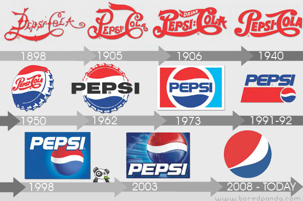
Pepsi Logo Evolution

(via boredpanda)
Manufactured and marketed by PepsiCo, it was first developed and produced in the early 1890’s by Caleb Bradham, a pharmacist in New Bern, North Carolina labeled as “Brad’s drink”. In 1898, Bradham renamed his drink into “Pepsi-Cola”.

Thursday, July 7, 2011

Top 15 Worst Logo FAILS Ever


Source

Marketers say that one of the most important marketing tools is a good logodesign. It not only provides an easy to recognize identity for your business but also communicates who you are. That’s why every company considering creating or buying a logo design should know the criteria that make for an effective logo.

The first feature of a good and effectivelogo is that it can immediately “grab” viewer’s attention. Your logo should have an immediate impact and hold the viewer’s attention.

However, if you did manage to catch the viewer’s eye – that doesn’t necessary mean you are doing good. There might always be a hidden penis you cannot see at first sight.

Here’s a list of Top 15 Worst Logo Fails of all time which probably didn’t look so bad at first glance.

Logo of Catholic Church’s Archdiocesan Youth Commission

This is an actual logo designed in 1973 for the Catholic Church’s Archdiocesan Youth Commission. It even won an award from the Art Directors Club of Los Angeles.

Honest Logos By Viktor Hertz (Part II)

Source

For those who haven’t seen the Part I of Honest logos by Viktor Hertz, first take a look: here. Now that you’ve done that, we’d like to show you some more new logos from Viktor’s ongoing series titled “Honest logos”.

As we’ve talked before, Viktor Hertz is a freelance Graphic Designer from Sweden who turns well known logos into “Honest Logos”. He does that by cleverly changing the name of the company while still preserving the original style of the logo.

“An idea for a series with honest logos, revealing the actual content of the company, what they really should be called. Some are cheap, some might be a bit funny, some will maybe be brilliant. I don’t know.” says the artist.

Websites: flickr | twitter

 
Related Posts Plugin for WordPress, Blogger...